Atlanta Dream
The league approached Tantrum Agency to help reposition the Atlanta Dream in 2019 to coincide with the team moving to a new arena in 2020. We were challenged to not only think about what the team represents, but how the new positioning expresses itself through a new brand identity. The new identity would be rolled out through all touchpoints by summer 2020.
-
Professional Sports
-
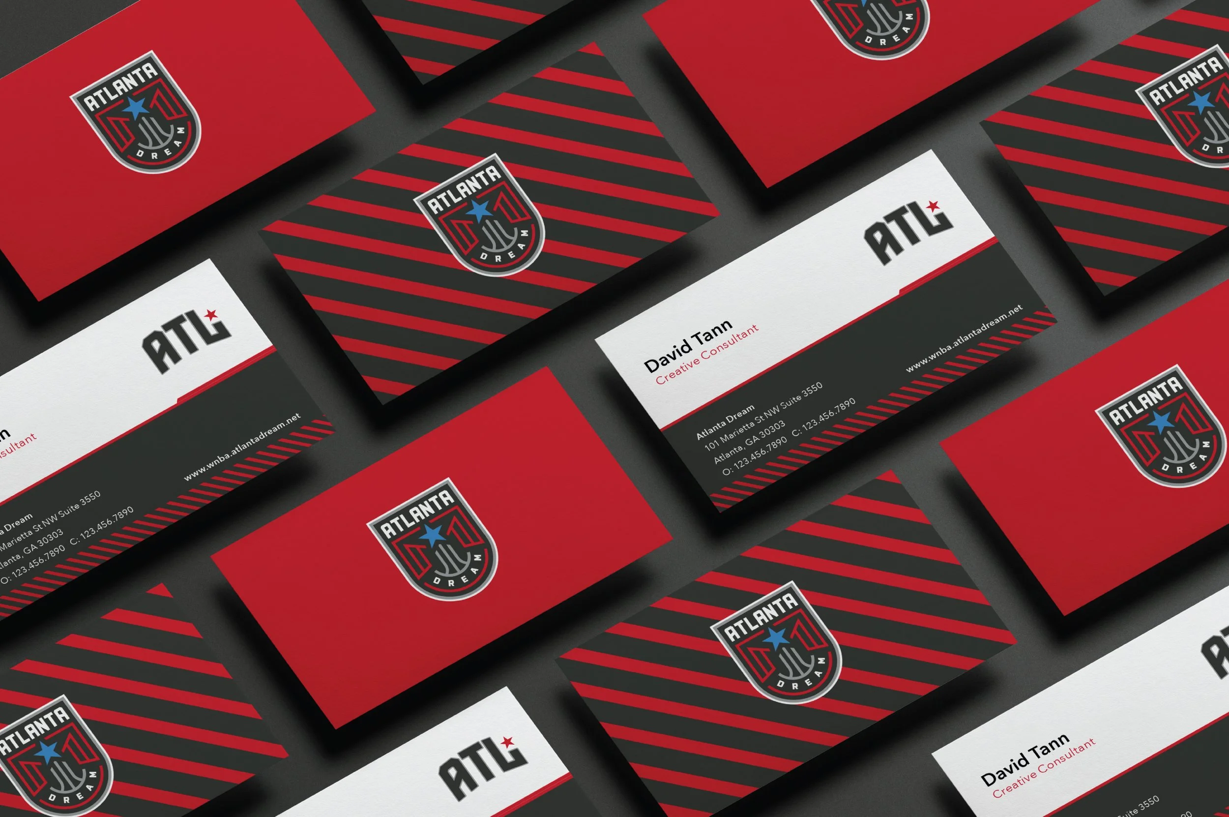
Full Brand Identity, Social Media, Web, Print
-
Summer 2020

The Dream Team.
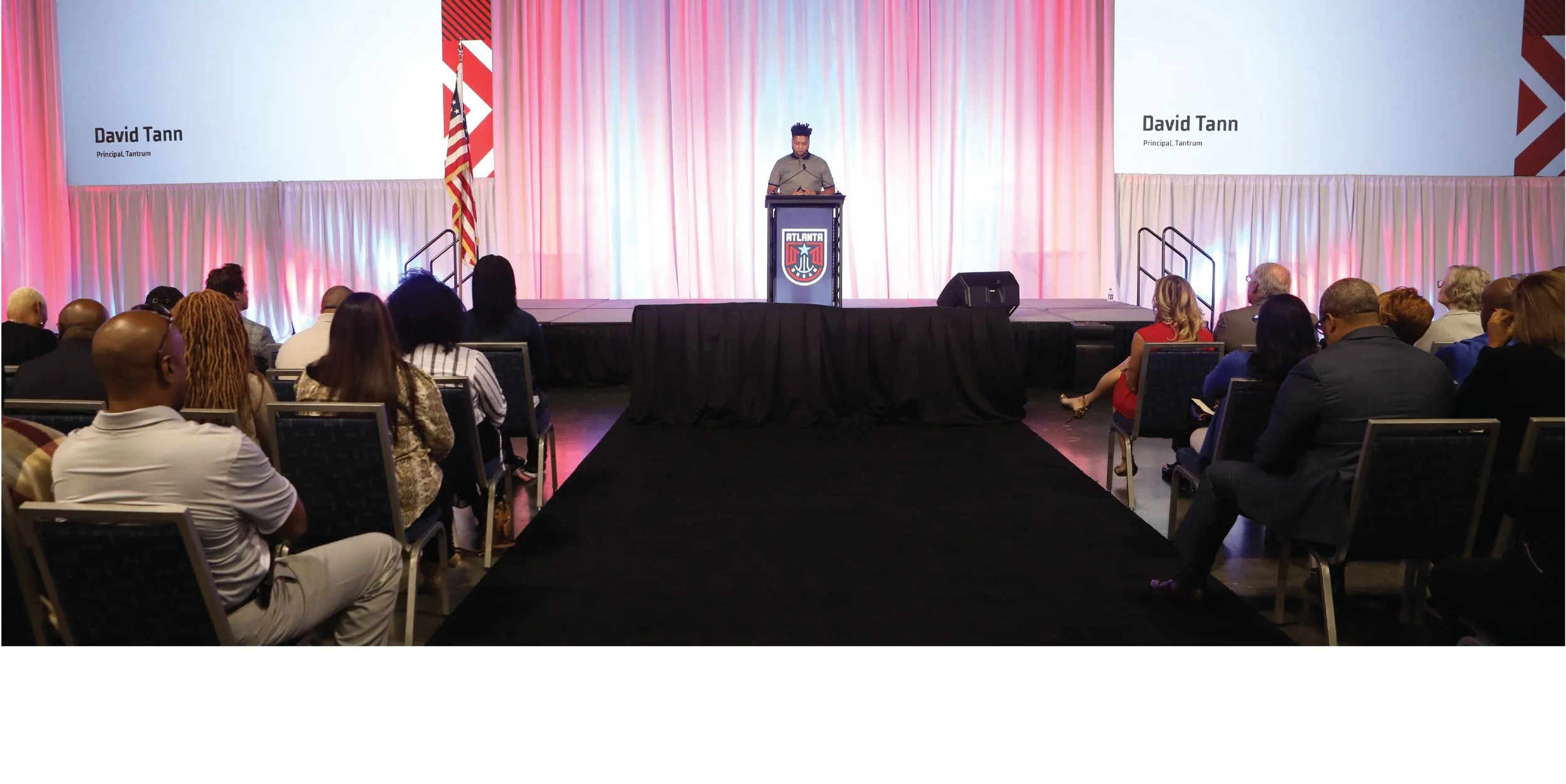
I teamed up with a crew of very talented people to tackle this job. Tantrum is a multidisciplinary branding firm and creative consultancy located in Atlanta and headed up by creative director and founder David Tann. David pulled together a “Dream Team” of designers, writers and filmmakers to create the best brand experience possible.


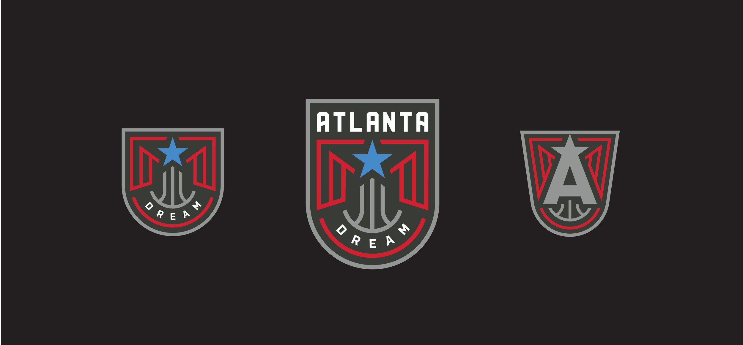
The exciting new primary logo is composed of a combination of icons that relate directly to Atlanta and its history. The rising phoenix symbolizes the city’s rise from the ashes of the Civil War to become a world city. The shooting star ties the Dream back to its roots and is prominent within the formal logo. Finally, the basketball represents the game we pour everything we have into each day.


Brand Expression.
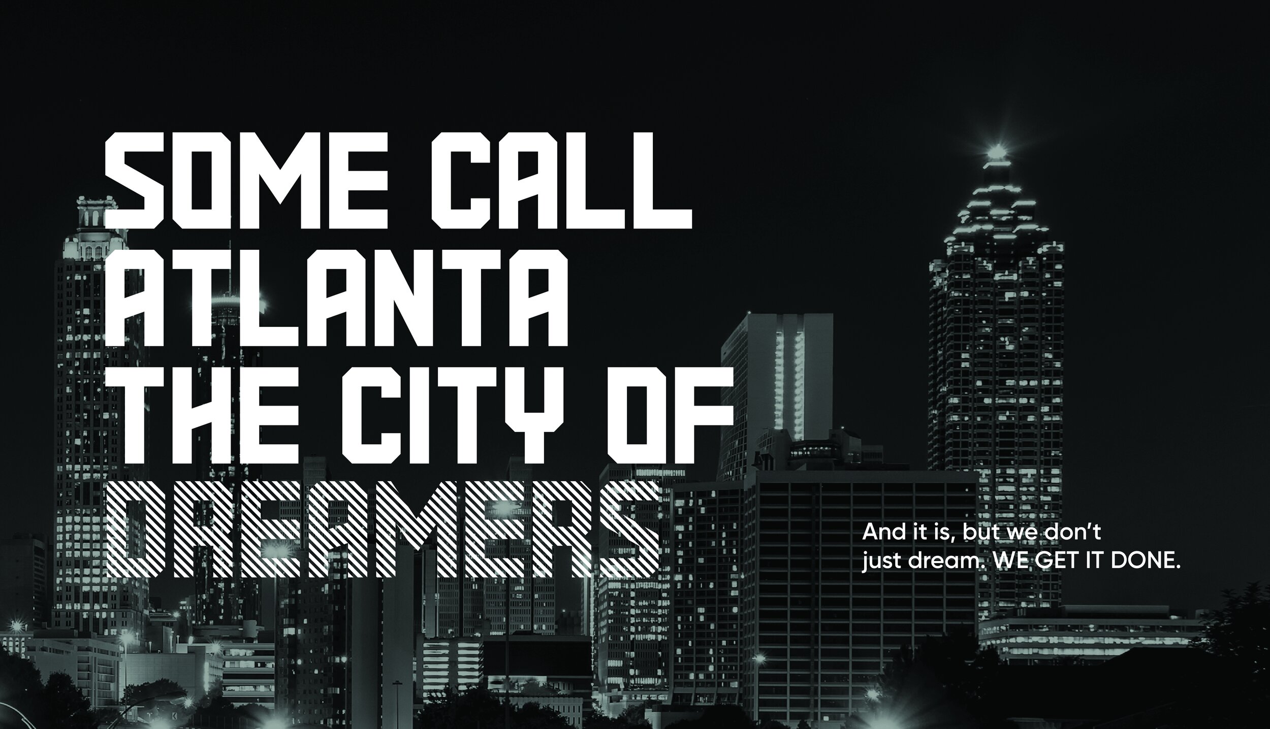
The new brand’s expression takes shape through a combination of energetic imagery, bold graphics and color blocking. If the new logo is symbol of Atlanta’s pride, the brand expression is symbolic of the city’s grit, energy, and can-do attitude. We needed to create a brand that demands attention. Something that not only expresses the same intensity this team shows, but also everything that Atlanta has become as a whole. A city of hustlers and dreamers focused on progress and forward movement.